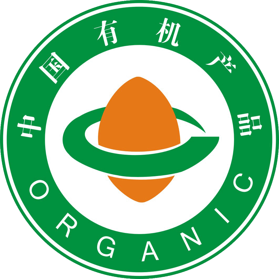
“The main design of the ”China Organic Product Logo“ and the ”China Organic Conversion Product Logo" consists of three parts: the outer circle, the seed graphic in the center, and the ring-shaped lines around it.文章源自FOFCC-http://fofcc.org.cn/am/11199/
The circular shape around the logo resembles the globe, symbolizing harmony and safety. The words “中国有机产品” (Chinese Organic Product) and “中国有机转换产品” (Chinese Organic Conversion Product) within the circle are presented in a combination of Chinese and English. This not only signifies that Chinese organic products are in step with the world, but also facilitates identification by domestic and international consumers.文章源自FOFCC-http://fofcc.org.cn/am/11199/
በአርማው መሃል ላይ ያለው የዘር መሰል ግራፊክ በቡቃያ ወቅት ያለውን ሕያው ሕይወት የሚያመለክት ሲሆን ይህም ከዘር ወደ ዘር የሚደረገውን የኦርጋኒክ ምርት የምስክር ወረቀት አጠቃላይ ሂደትን የሚያመለክት ሲሆን እንዲሁም እንደ አዲስ የበቀሉ ዘሮች ያሉ ኦርጋኒክ ምርቶች በቻይና ምድር ላይ በከፍተኛ ሁኔታ እያደጉ መሆናቸውን ያሳያል።文章源自FOFCC-http://fofcc.org.cn/am/11199/
The smooth and flowing lines surrounding the seed shape symbolize a circular path, which, combined with the seed shape, forms the Chinese character “中” (Zhong), reflecting that organic products are rooted in China and that the path of organic development is growing ever broader. Meanwhile, the circular ring on the plane is also a variation of the English letter “C,” and the seed shape is a transformation of “O,” together meaning “China Organic.” Green represents environmental protection and health, indicating that organic products bring perfection and harmony to humanity's ecological environment. Orange-red represents vigorous vitality, indicating the role of organic products in sustainable development. The brownish-yellow in the “China Organic Conversion Product Certification Mark” represents fertile land, indicating that organic products continue to develop on fertile soil.文章源自FOFCC-http://fofcc.org.cn/am/11199/