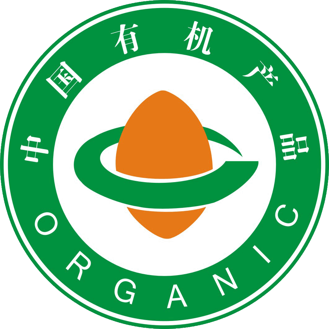
“The main design of the ”China Organic Product Logo“ and the ”China Organic Conversion Product Logo" consists of three parts: the outer circle, the seed figure in the center, and the ring-shaped lines around it.Artikel berasal dariFOFCC-http://fofcc.org.cn/ms/11199/
The outer circle of the logo resembles the Earth, symbolizing harmony and safety. The words “China Organic Product” and “China Organic Conversion Product” within the circle are presented in a combination of Chinese and English. This not only indicates that China's organic products are in step with the world, but also facilitates identification by domestic and international consumers.Artikel berasal dariFOFCC-http://fofcc.org.cn/ms/11199/
Bentuk seperti biji di tengah logo melambangkan semangat hidup yang semarak pada permulaannya, menyimbolkan proses pensijilan produk organik yang bermula dengan biji. Ia juga menandakan bahawa produk organik, seperti biji yang baru bercambah, berkembang pesat di seluruh tanah air China.Artikel berasal dariFOFCC-http://fofcc.org.cn/ms/11199/
The smooth and flowing lines around the seed figure symbolize a ring-shaped path, which, together with the seed figure, forms the Chinese character “中” (Zhong), reflecting that organic products are rooted in China and that the organic path is growing broader. At the same time, the ring on the flat plane is also a variant of the English letter “C,” and the seed shape is a transformation of “O,” meaning “China Organic.” Green represents environmental protection and health, indicating that organic products bring perfection and harmony to humanity's ecological environment. Orange-red represents vigorous vitality, indicating the role of organic products in sustainable development. The brownish-yellow in the “China Organic Conversion Product Certification Logo” represents fertile land, indicating that organic products continue to develop on fertile soil.Artikel berasal dariFOFCC-http://fofcc.org.cn/ms/11199/