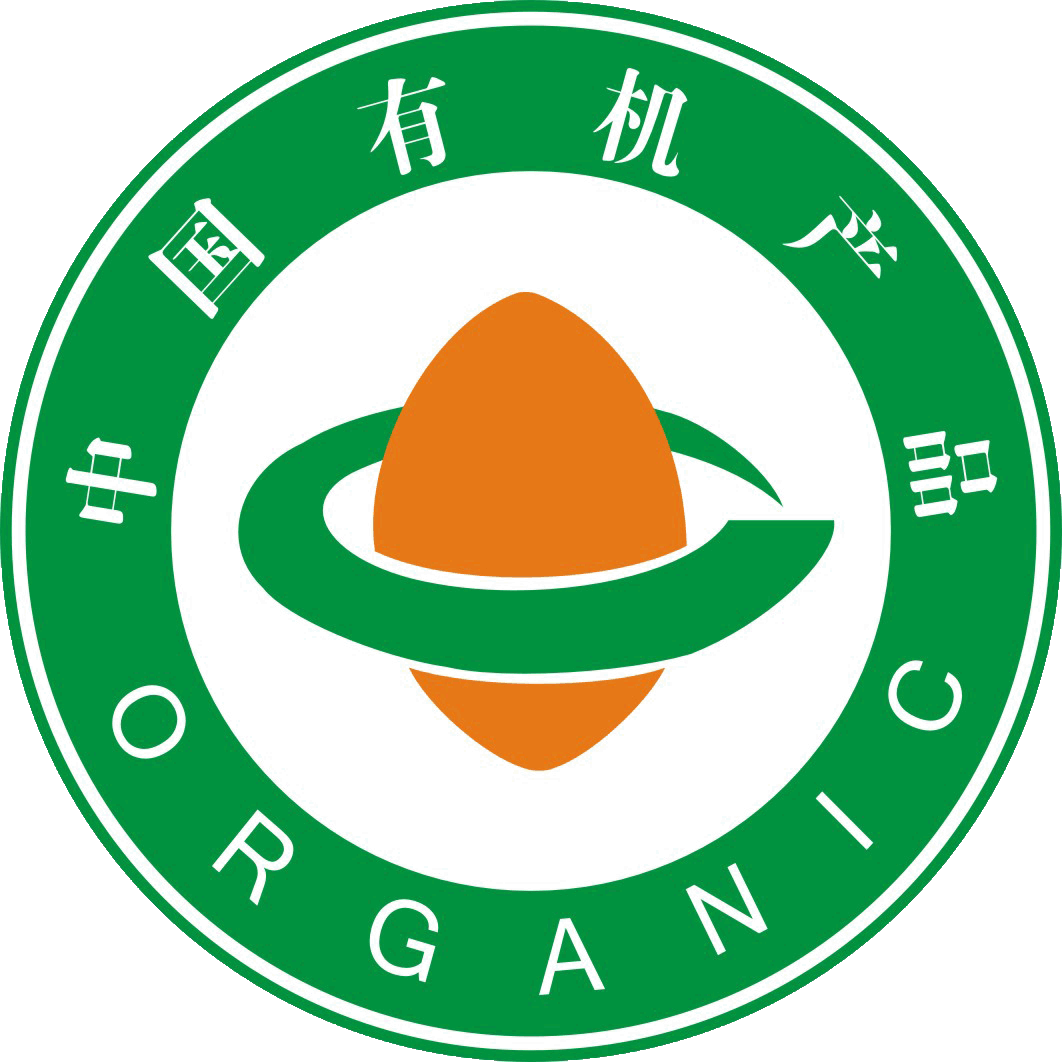
“The main designs of the ”China Organic Product logo“ and the ”China Organic Conversion Product logo" consist of three parts: the outer circle, the seed graphic in the middle, and the circular lines surrounding it.文章源自FOFCC-http://fofcc.org.cn/en/11199/
The circle around the logo resembles the Earth, symbolising harmony and safety, and the words “China Organic Product” and “China Organic Conversion Product” inside the circle are in a combination of Chinese and English. This not only indicates that China's organic products are on a par with the rest of the world, but also facilitates recognition by domestic and international consumers.文章源自FOFCC-http://fofcc.org.cn/en/11199/
The seed-like graphic in the middle of the logo represents the vitality of life at the time of sprouting, symbolising the whole certification process of organic products from the seed, and at the same time indicating that organic products are just like freshly sprouted seeds, which are thriving on the Chinese soil.文章源自FOFCC-http://fofcc.org.cn/en/11199/
The smooth, flowing lines surrounding the seed graphic symbolise a circular road, which merges with the seed graphic to form the Chinese character “中” (Zhong), reflecting that organic products are rooted in China and that the path of organic development is broadening. At the same time, the two-dimensional ring is also a variation of the English letter “C”, and the seed shape is a transformation of “O”, signifying “China Organic”. Green represents environmental protection and health, indicating that organic products bring perfection and harmony to the human ecological environment. Tangerine red represents vibrant vitality, indicating the role of organic products in sustainable development. The brownish-yellow in the “China Organic Conversion Product Certification Mark” represents fertile land, indicating the continuous development of organic products on fertile soil.文章源自FOFCC-http://fofcc.org.cn/en/11199/