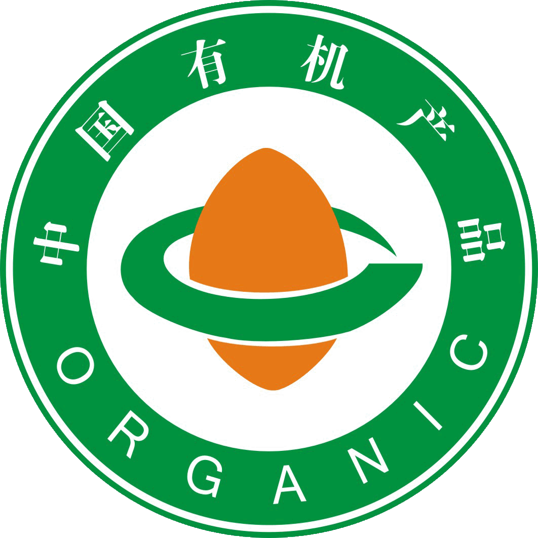
“"Хятадын органик бүтээгдэхүүний лого" болон "Хятадын органик шилжилтийн бүтээгдэхүүний лого"-ийн үндсэн загвар нь гурван хэсгээс бүрдэнэ: гадна тойрог, төвд байрлах үрийн хээ, түүнийг хүрээлсэн шугамуудын бөгж. &...Өгүүлэл нь ...-аас авсанFOFCC-http://fofcc.org.cn/mn/11199/
The circular shape around the logo resembles the globe, symbolizing harmony and safety. The words “中国有机产品” (China Organic Product) and “中国有机转换产品” (China Organic Conversion Product) within the circle are presented in a combination of Chinese and English. This not only signifies that China's organic products are in step with the world, but also facilitates identification by domestic and international consumers.Өгүүлэл нь ...-аас авсанFOFCC-http://fofcc.org.cn/mn/11199/
Логоны төвд байгаа үрийн хэлбэр нь нахиалах мөчийн амьдралын эрч хүчийг илэрхийлнэ. Энэ нь үрнээс эхэлдэг органик бүтээгдэхүүний иж бүрэн гэрчилгээжүүлэх процессыг бэлгэдэж, мөн органик бүтээгдэхүүнүүд шинэ нахиалсан үр шиг Хятадын нутаг даяар цэцэглэн хөгжиж байгааг илтгэнэ.Өгүүлэл нь ...-аас авсанFOFCC-http://fofcc.org.cn/mn/11199/
The smooth and flowing lines surrounding the seed graphic symbolize a circular path, which, combined with the seed graphic, forms the Chinese character “中” (Zhong), reflecting that organic products are rooted in China and that the path of organic development is growing ever broader. Meanwhile, the circular ring on the plane is also a variant of the English letter “C,” and the seed shape is a variation of “O,” together meaning “China Organic.” Green represents environmental protection and health, indicating that organic products bring perfection and harmony to humanity's ecological environment. Orange-red represents vigorous vitality, indicating the role of organic products in sustainable development. The brownish-yellow in the “China Organic Conversion Product Certification Mark” represents fertile land, indicating that organic products continue to develop on fertile soil.Өгүүлэл нь ...-аас авсанFOFCC-http://fofcc.org.cn/mn/11199/